Nexus Cognitive came to PAVO as a small group of consultants focused on services that connected people with cutting-edge technologies. They were seeking a logo to help cement their brand and differentiate themselves in the market.
Nexus Cognitive's name is inspired by the word "nexus", which means a connection or series of connections linking two or more things. They wanted their branding to reflect their focus on innovative, people-centered solutions.

Solution:
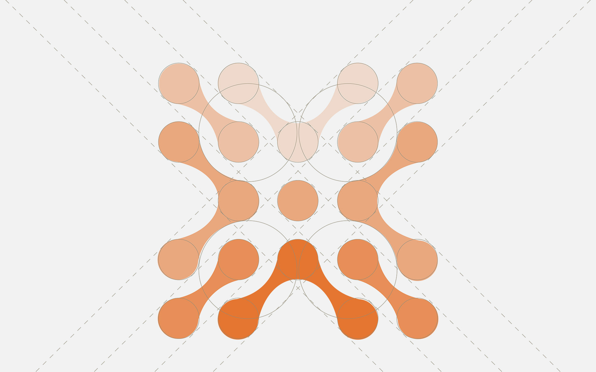
Working closely with Nexus Cognitive to understand their values, mission, and target audience, PAVO began by developing a logomark that incorporated an 'X' shaped icon representing the connections between people and technology.
Complimentary colors and typography were carefully selected to reflect the company's personality and vision, with orange conveying enthusiasm and excitement, and blue symbolizing reliability. For the letters, a modern, sans-serif font was chosen.
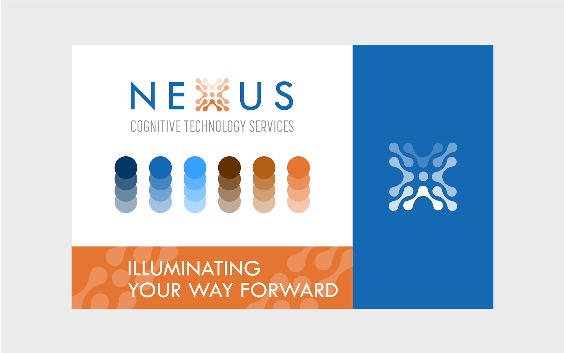
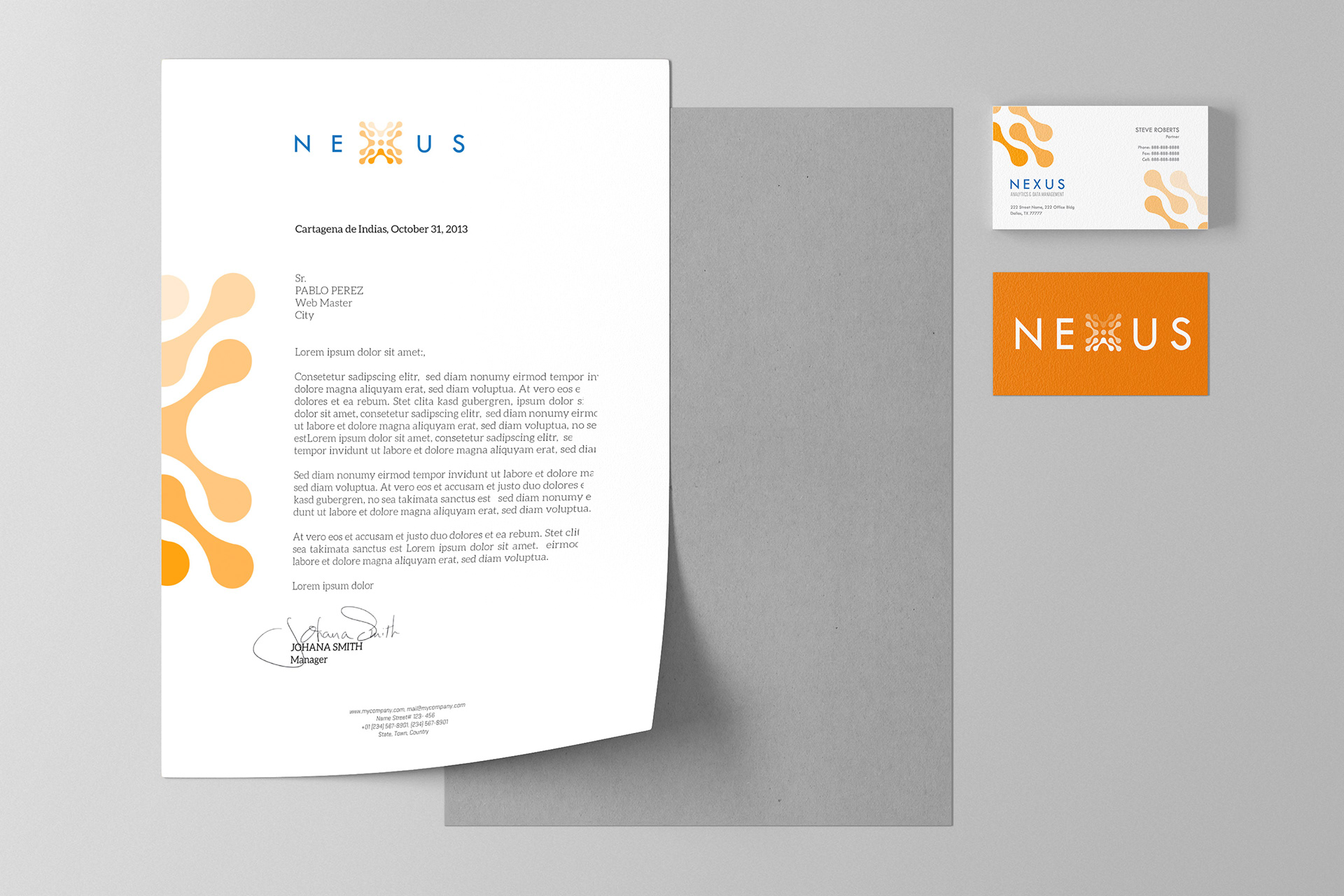
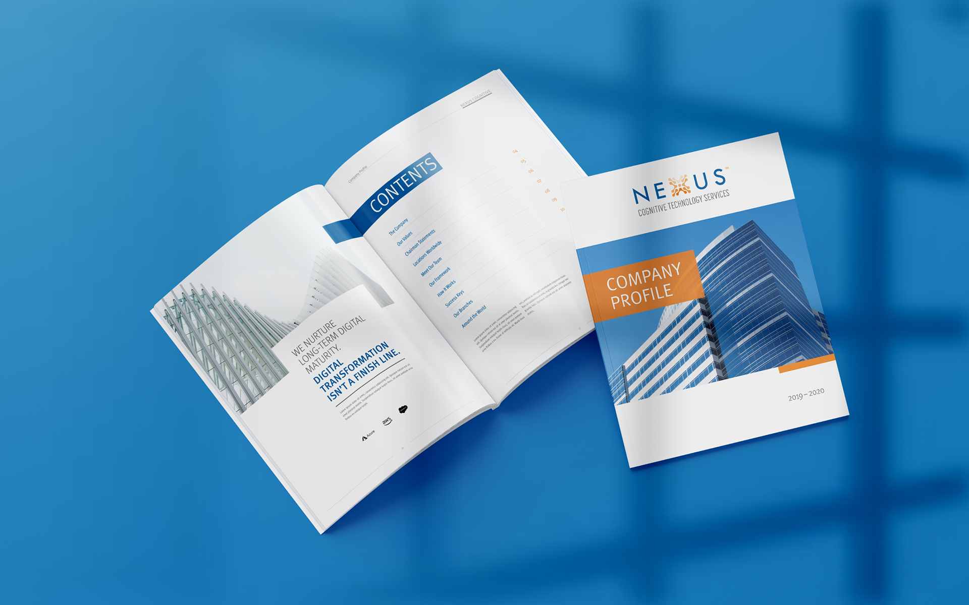
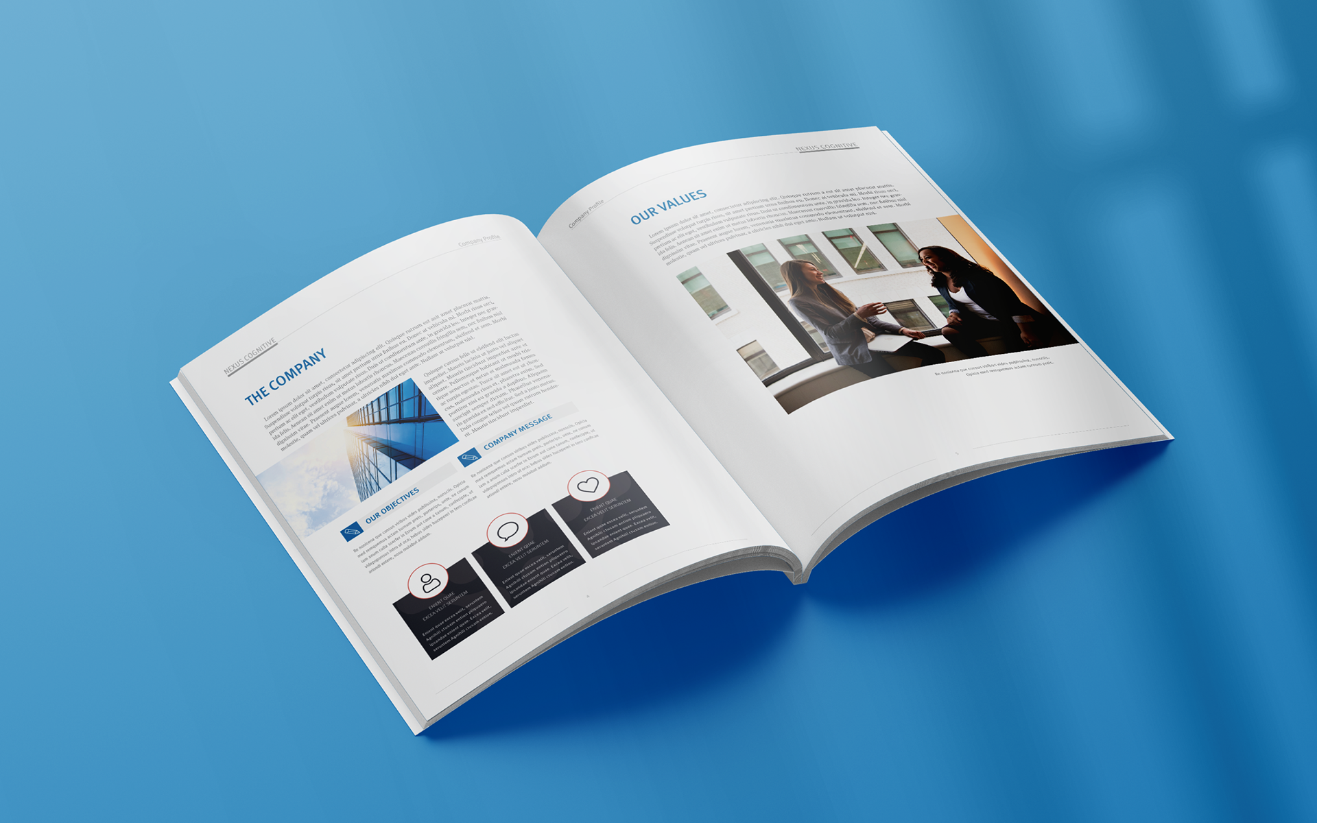
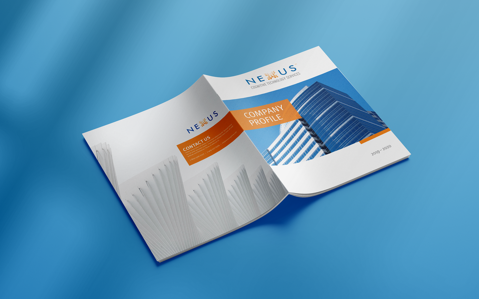
A stationary branding system was created that included business cards, letterheads and envelopes. Additional materials provided were business briefs templates and PowerPoint templates. The result was a cohesive and memorable brand identity that reflected Nexus Cognitive's mission.
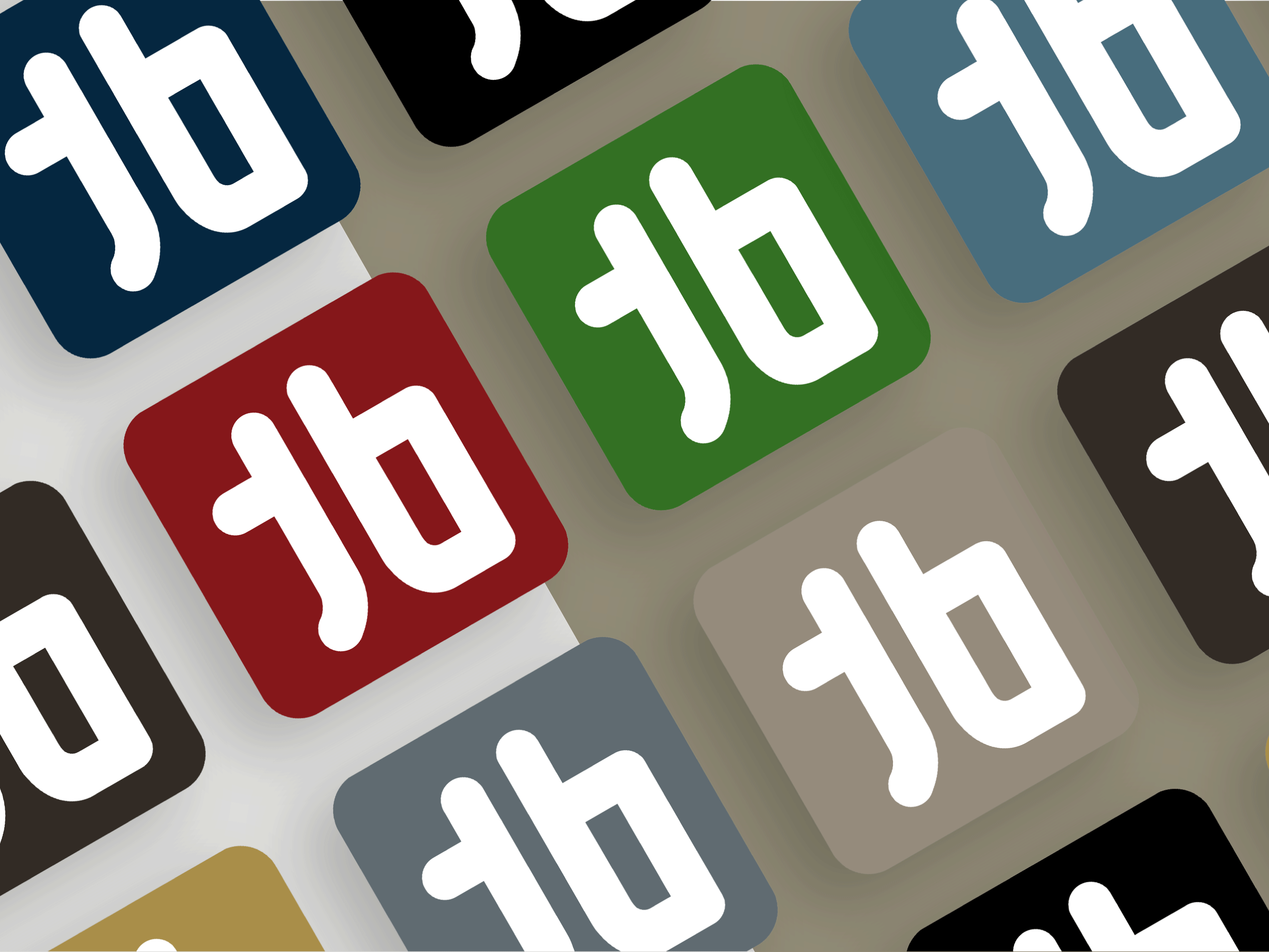
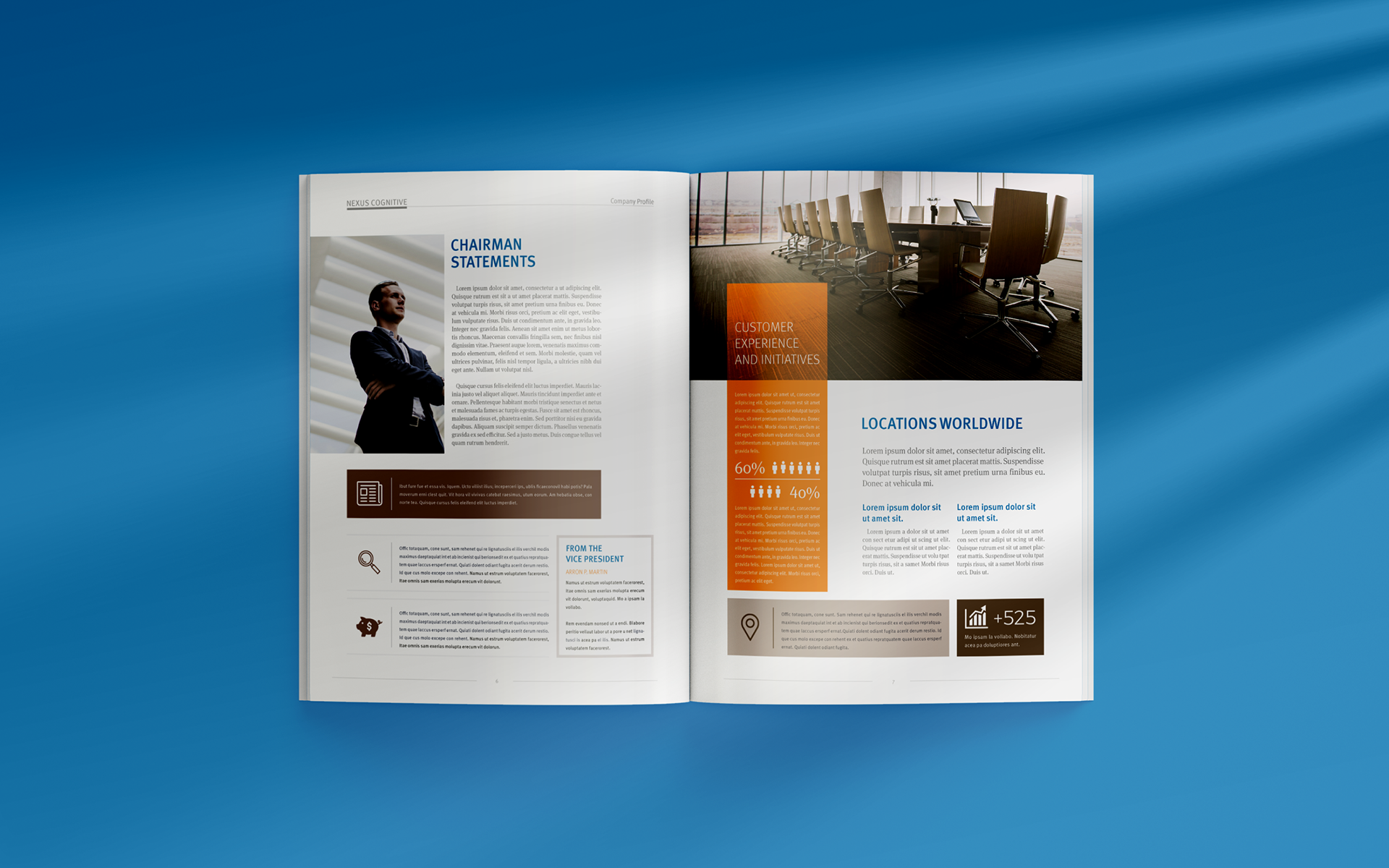
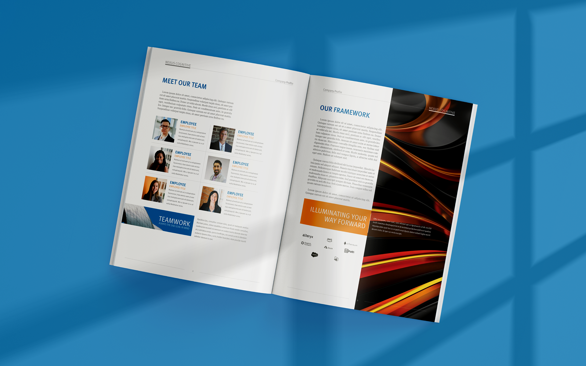
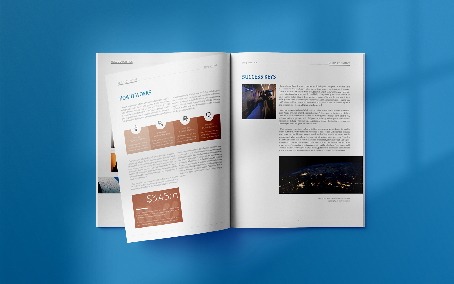
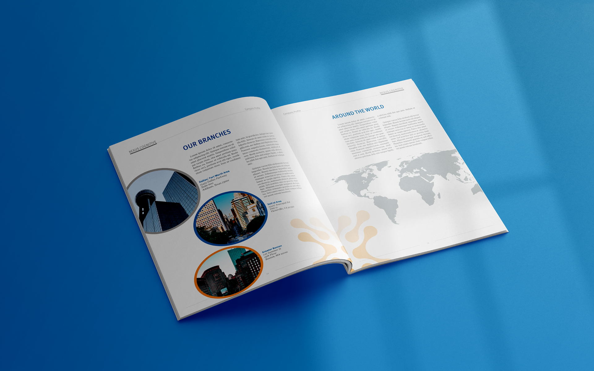
Business Brief Template
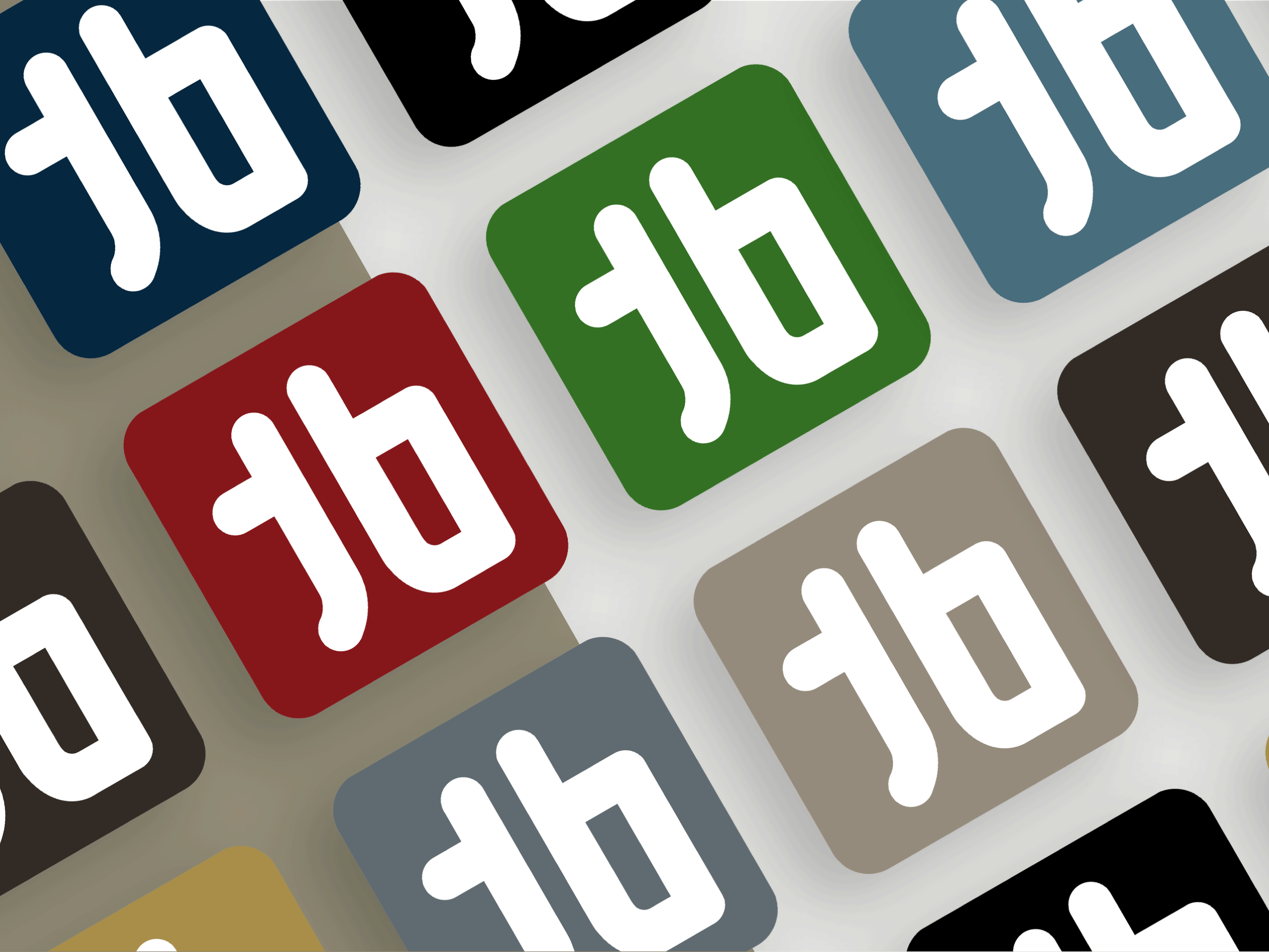
PowerPoint Presentation Template
PowerPoint Presentation
Conclusion:
Nexus Cognitive's logo design is an example of how a clear vision and partnership with a design agency can help establish a strong, professional identity. With a logo that accurately reflected their vision, Nexus Cognitive was able to differentiate themselves in the market and establish trust with their target audience.
Their logo has since evolved, but the core 'X' symbol remains synonymous with their mission. It has served them well as they continue to grow and expand their locations and services.